Cover Design
My mother, Susan, designed book jackets and laid books out for publication. In her younger and healthier days, she sculpted. I remember her toting heavy bags of clay and welding. She worked with lost-wax and bronze. For a decade-plus, she live part of the year in northern Italy sculpting in marble. With a decline in health, she worked from a desk. Oh, we could fuss at each other. She had the ideas but lacked the computer skills to execute them. I had the skills but little interest in her work. The push-and-pull of family dynamics.
Now needing a book cover, I miss the dynamics of our conversations.
The Little Ambulance War of Winchester County
- Smashed Ambulances (so bad, I never started)
- Vermont State Flag (failure)
- Mycelial Network (failure)
- A Vermont Noir – so maybe this will work?
4. Vermont Noir
Vermont looks great in the postcards with a church spire rising from a valley surrounded by the autumnal hues of reds, orange, yellow, and brown. We love the ski photos too. The red barn with cattle, sheep, and old farm house, that’s familiar. Then there is that sense of isolation, remoteness and starkness that locals experience.

This work came from the artistry of https://www.karenvermeulen.com/.
3. Mycelial Network
Throughout the novel, I describe PTSD as a series of black-fibers and as a mycelial network. Lexi describes PTSD as “tinea mentis” a concept that blends the technical name for athletes foot, a fungal infection, and mentis referencing the brain.
I searched for related images. There are some brilliant images out there augmented by the use of Star Trek’s mycelial flight technology. The imagery spanned from the highly scientific to the stylized images of computer networks. I spent time looking at a spider web clinging to my office window. But a spider hanging from a web bring exactly one story to mind. Some Pig. I need to avoid the link to books for young readers.
I explored a black-on-black motif using matt and gloss. That would require embossing the cover. Great idea for old-world books. But podcast and audiobook covers are 3000px square and often too small to resolve. Black-on-black would fail. Working with Illustrator, I remembered the paperback cover for my father’s book Fletch.

The colors of red, black, and white presented boldly to the shopper. In our house, we called it, rouge et noir. I was a kid back then. I added this concept to my own cover art.
In a tip-of-the-hat, I also stole/borrowed, the opening dialogue from my fathers book. You’ll find it at the opening of chapter Two. That’s for another story.
2. Vermont State Flag
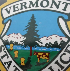
The Vermont state flag displays the state seal on a blue background. The seal has a field, a pine tree, a cow, hills and a few haystacks. These are images that reckon to the state’s agricultural roots.

Piggies / Vermont State Police Decal
In 2008, an unknown prisoner modified the state seal. The prisoner substituted little piggy faces for the stacks of hay. It took four years for someone to see these little faces and understand the intended slander. Read the story here: NPR
I explored riffing on this state seal. Instead of the cow and hay, I could have ambulances facing off in a green pasture. I did a bit of work with water colors and cut-outs.
1. Smashed Ambulances
There are several themes throughout the book. The first and most obvious involves ambulances at war. I asked: is it possible to illustrate ambulance smashing into each other or other means of showing violence and such. It was a terrible idea. Failed within minutes of picturing wrecked ambulance. I’ve seen it. I have experienced the pain that results. No!
Chip Kidd says while standing on front of an image of an apple and the word “Apple”: You don’t need both. The least useful thing to put on a book with the word “ambulance” in the title is the actual ambulance.
Fail.